Friday, December 18, 2020

Traditional Art - Apocalypse Landscape #10

 For my apocalypse environment based on the Chernobyl virtual tour I first thought about whether to make it into a cityscape or landscape. I created quick prep sketches to get an idea of a composition, thinking about what tones would best represent a destroyed environment. I felt a cityscape could make for some interesting shapes when it came to desolate buildings and such but knowing that this piece would be in colour I decided a landscape would be better because I felt I could introduce more colours that way.

I started my landscape by doing a quick sketch of the whole environment, framing off a portion of the page to ensure the scene remained proportional. I wanted to include a water tank like I had in one of my sketches and keep that as a primary focal point. Knowing that would be using fairly muted colours like browns and greys, I made sure to have some foliage around it so that it was clearly visible and didn’t just fade and blend with the greyness of the background.

I chose to use colouring pencils as my dry medium but when starting to colour, it was bit tricky to get the values I wanted for the scene since I had limited colours to choose from. Much of the colouring process was me having to resort to leaving some values lighter than I would’ve liked to compensate for the lack of colour variation. I feel as though the landscape could’ve been better with more colours to choose from and a better handling on my blending technique between colours but the final piece still turned out to be something I liked. If I’m to do more pieces with coloured pieces in future I will need to practice more on the best ways to approach blending, or perhaps try another medium like pastels.


Traditional Art - Jack the Ripper Environment #9


The development of my Jack the Ripper environment was a difficult one due to me focusing on the wrong aspects of the drawing at the beginning which led to having to make quite a few corrections towards the end.

From my preparatory sketches, I knew I wanted a strong contrast in tonal values- heavy darks against lights and make it so the light tones fade into the background. I don’t think that was necessarily a bad plan but focusing on the heavy darks first made it so I went a bit too dark initially. With going so dark, my rendering got a bit blocky and there were very little tonal shifts in the darkest building towards the front. On one hand I had a basis on what was dark and I knew not to go as dark as that tone on more or less everything else. On the other hand my foreground objects were looking a bit flat and boring. 

The rest of the drawing compositionally felt a bit narrow but it had the contrast in tones that I wanted. With all this though, I could’ve done more to introduce a more eerie atmosphere which would’ve better suited a Jack the Ripper landscape. I could’ve potentially made the tones on the street a bit less varied to look like fog or darkened down the lighter tones by a bit to give a more night time impression.


Traditional Art - Jack the Ripper Environment #8

 My preparatory sketches for my Jack the Ripper environment consisted of me thumbnailing ideas in terms of composition, tonal range and line work.

From experimenting with these sketches I knew I wanted a distinct value range that showed a of contrast- I wanted there to be faded lights against deep darks. Having this would make for a clearer silhouettes in an environment that could be quite dark and brooding. Strong contrasts coupled with a composition that is quite tunnelled (Like looking straight down a street) could make for a better focal point as your eyes will be guided. In regards to linework I wanted to see were details could be brought in to the landscape and thought roof tiles and street objects with varying line weight could bring some interesting details to the piece. 


Traditional Art - Landscape #7


When starting my landscape drawing for my traditional work, I chose a place that I was a familiar with so I had a better reference of the 3D space I’d be drawing. I chose to draw Richmond Bridge in London, more precisely the view looking onto the River Thames from Richmond Bridge.

Developing this piece was fairly difficult in some areas because I had to make the decision between artistic modifications and absolute accuracy. When it came to tonal values, there were point when drawing that I’d look at my reference and a value would be fairly light (like many of the trees) but by keeping that light tone, the shapes of everything in the scene would blend together too much that you couldn’t differentiate anything. With this I had to darken down many things just to have enough contrast between layering objects. There was a lot of stepping back away from the piece and looking at it from afar to make sure that my judgements were doing more good than harm.

I purposely framed an area on the page for me to draw in as I have a habit of drawing too large and then not being able to fit everything I need to in. Doing this helped a lot with managing how to scale my drawings better (which is I feel especially important when drawing whole landscapes). I was able to box in an interesting area to focus on and draw rather than being concerned about getting everything in whilst running out of space.


Wednesday, December 16, 2020

Digital Art - Apocalypse Vehicle #9


After much spending a good amount of time adding, reworking and manipulating images together, I got the front and back view of my vehicle completed.

I added a person alongside to give a visual representation of the size I imagine the vehicle to be plus a shadow underneath to give some more 3D depth.


During the process of photobashing, I tried to keep a good balance between my primary big shapes, secondary shapes and tertiary details- it was very tempting to go overboard on the small parts because I had so many images at my disposal that I wanted to use parts of everything. But to keep the vehicle looking realistic and believable I had to have areas of rest alongside more cluttered spaces. This involved erasing and lowering the opacity a lot on things like rust and tears to keep them subtle and not detract from the vehicle as a whole.

Also, despite having many images to choose from, I had to think outside the box to find sections of photographs that would work well for my vehicle. My normal instincts tell me that if I want a window then I should search for a window to use as a window however for some sections I had to do some unconventional thinking to find a base for what I needed. For example I wanted a mirror for the vehicle but all the images I found had cars with mirrors of the wrong shape, wrong perspective, etc. I changed my approach for this and began looking for something with the shape I wanted rather than the actual object I wanted. This ended with me using a traffic light as a mirror, drawing over it to get the details I wanted.


This was a bit of a challenging final step since there was a lot I had to consider in regards to perspective, proportions, whether things worked or not according to my final sketch but overall I like the outcome of my vehicle. I think it suits the circumstances I’d imagined for it (a bug apocalypse) well whilst also being fairly unique in terms of design. It reads as an ambulance which was what I wanted but is also semi exaggerated what with the huge wheels and extruding additions on the panels. I’ve learnt some techniques that I can see myself bringing forward into future projects, like blocking shapes out in 3D as a starting point, and am more confident in my approach to photobashing.


Digital Art - Apocalypse Vehicle #8


With the base being sorted, I moved my vehicle forward by implementing the other shape elements that created the overall silhouette. I continuously took sections of photographs, manipulated them then drew over the to get them to blend the way I wanted, moving all over the piece to keep it cohesive. Some portions required me to just draw directly onto the vehicle rather than manipulate a photo (for example the triangular windows) just because they were a bit too specific to find a photograph that fit the shape and perspective I wanted. I was very focused when doing this to make the drawing blend well with the rest of the vehicle and didn’t look too outlandish.  


I also started to implement some details in like logos and colour variations, mainly to get a scope on how well they carry against the large frame. It was a case of if they were too small or too blended to see then there was no point in giving them immense detail. Identifying this meant I could spend less time on areas that weren’t adding as much to the vehicle as a whole.


Digital Art - Apocalypse Vehicle #7


For my vehicle project, I’d began collecting images to use when photobashing and had created a base frame for my vehicle, referring to my sketch done prior. All the photos I’m using are free to use images for Pexels and Textures.com – I’m avoiding using images from Google images or Pinterest as to not infringe on copyright. It only limits me partially but both websites have a wide variety of images to chose from so if I need something absurdly specific I’ll just have to get creative with what I have.

I created my base by merging three different vehicles together- a forklift, school bus and range rover. I’d sketched out the shape I wanted then manipulated the images to fit how I wanted. This first step took quite a bit of rearranging to get to a point where I could start layering things on top. But it was crucial to get this step right before moving forward otherwise everything else wouldn’t look quite right so I took my time with this.


Digital Art - Apocalypse Vehicle #6


After deciding between the colour variants I’d created, I created a final sketch of what I wanted my vehicle to look like. The sketch had all the basic elements that I wanted to portray when photobashing and I was able to delineate focal points on the vehicle with some very simple rendering. I kept my final sketch to the main shapes like the bulk of the vehicle, the wheels and extruding parts so that I could scope out an overall read of the vehicle and see if its purpose held up when rendered. This final sketch gave me a good idea of what images I could use when photobashing details in and how to keep the vehicle dynamic and interesting.


Game Production - Backyard #10

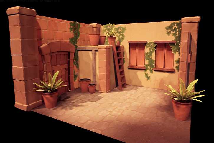
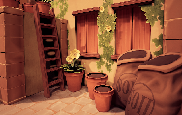
 With everything in place, adjustments made and details created, I can call my backyard slice finished. This was a bit of a challenge in terms of approaching all these new methods and workflows to create PBR materials- the majority of work I’d made prior was all hand painted, diffuse only models. It took a bit to fully understand what each map type does, how they work together and how to create a balance between them so that the material doesn’t look over zealous and it harmonises with all the other materials in the scene. Creating this scene took a lot of back and forth, doing and redoing to find methods I thought worked efficiently and also create a look that was aesthetically pleasing.


1 thing that learnt from doing this project was Substance Designer as a whole program (I’d never used it prior to this). Learning how to procedurally create textures was a very interesting process since I’m so used to just using Photoshop and painting whatever material I needed. Seeing what each node does and how they all work together was fun to experiment with and being able to change just a few nodes to alter the entire look of my final material was definitely useful in quickly generating textures. Definitely a lot faster than having to repaint it entirely.

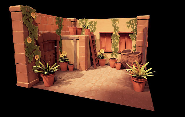
Things I felt went particularly well with this project were my approach to using UE4 and my sculpting in Zbrush. Although I didn’t do anything extremely complex in Unreal I feel a lot more confident in creating materials and altering them using various nodes and also setting up a scene to look good via lighting and post processing. I’d done quite a lot of research into the aesthetics of Unreal, looking at artists like Henric Montelius and Jasmin Habezai-Fekri to understand what makes their Unreal artwork so organic and how I could bring that into my scene. I feel as though the experimentation was worthwhile and the final scene looks really nice! I could definitely go further with more time and practice but for what I’ve done I think I’ve done well.


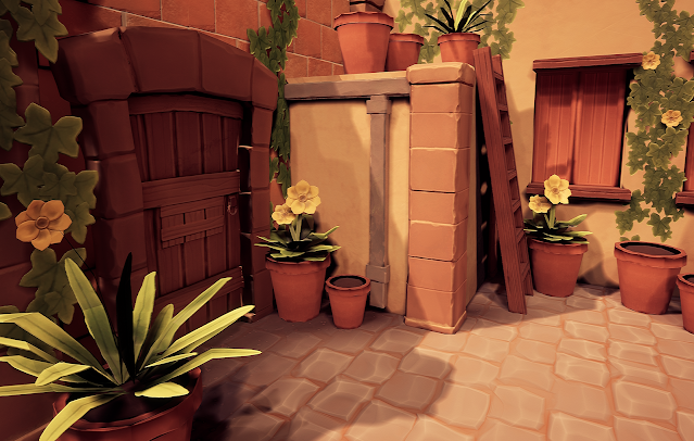
With my sculpting I feel as though it worked well mainly due to the stylistic approach I was going with for my whole scene. The details on my sculpts were subtle and most objects were smooth and even across the surface. If I were going for a more realistic style I feel as though I wouldn’t have been able to convey it well enough since I hadn’t used Zbrush all that much. That coupled with figuring out PBR materials, it most likely just wouldn’t have looked that great. Keeping it simple was better for my learning and I would be able to create an outcome that was achievable and looked good. I think I was able to carry out a cohesive style well across my sculpts and I can take my knowledge further now in other projects to create more complex sculpts.


That being said, I feel as though technically I could’ve done better on my topology management, specifically for retopology. Understanding what makes decent topology is definitely something I need to look more into, some models could stand to be retopologized more evenly and make for a more efficient use of tris. I think I was overly concerned on whether the high poly would bake well onto the low poly that I created unnecessary topology that wasn’t good from a technical stand point. I aim to improve my approach to retopologizing in future projects or see if a workflow of creating a low poly mesh before creating the high poly would be a better fit.


Overall, I like how my final scene came out. There were a lot of learning curves with this project that probably made me spend too much time on certain parts and not enough time on others, but with all individual parts coming together I think it looks pretty decent. I’ve learnt a lot from experimenting with this and I’ve got a lot of new knowledge that I’ll be taking forwards into future projects (not just for environments but characters too!).


Game Production - Backyard #9


What with everything being modelled now for my backyard slice, I was at the point of simply assembling everything together according to my original sketch. Some things had changed to better suit the scene in 3D but overall, I’ve stayed quite true to what I wanted right from the beginning.

I’d created a dirt texture in Substance Designer and added to the ground via vertex painting, giving the flooring a bit more variation. I implemented the wood and metallic objects and gradually started sorting out the greenery. In 3DSMax I’d sorted out the alpha planes for the foliage and made the plant shapes that I wanted so it was only a matter of arranging and rearranging in unreal to give my final scene a nice flow. Having created my lighting scheme prior was very helpful in seeing what areas of my environment were in shadow so didn’t draw all that much attention and what was in light to lead your eye. I tried to play into this by populating areas in direct light so that the assets make interesting shadows and I could leave those shadowy areas empty.


Game Production - Backyard #8


Moving on with my backyard slice, I’d reached the last few stages of modelling which were creating the foliage. I’d purposely left this till last so that I could map out beforehand where foliage would look best as it was going add quite a bit of contrast in my environment. The foliage had to be enough to make the scene lively but not too much that it was overcrowded and repetitive.

I did some research before sculpting out the foliage on what kind of flowers and plants were native to Italy to act as my reference. From that I found there’s a lot of natural ivy in Italy and I chose to base the flowers I create on Italian Anemones (They usually come in white or white and red but because of the lighting in my scene the white might get washed out so I will most likely change the colour).


With the plants being alphas I sculpted the individual leaf shapes in Zbrush and then also duplicated and arranged them to make the plant shapes I wanted like the clumps of leaves and strings of ivy. Doing this in Zbrush allowed me to see how to fit all the foliage onto a single texture sheet without the need to bake each asset, rearrange each alpha in Photoshop, etc – it was just much quicker this way.

Alongside making the foliage I also sculpted the plant pot and soil sack that would go alongside the foliage. The soil sack was interesting to sculpt because I wanted it to look heavy and full and to make some really definitive creases and folds that would translate well when baking onto a low poly mesh. I ended up looking at pillows for reference on folds which may have drawn away a bit from a realistic representation of a sack but due to the stylization of my scene I think I’ll be able to get away with it.


Game Production - Backyard #7


Continuing with my backyard slice, I spent some time planning out a trim sheet to use for my wood and metal assets. I thought using a trim sheet would be more efficient than having two separate texture sheets since the wooden and metallic objects I had left weren’t so complex that they needed to be un-wrapped uniquely, a tiling texture would suit them fine. 

I sculpted out the trim sheet in Zbrush, dividing the plane into 4 sections of wood and 1 section of metal. It was a fairly simple sculpting process since the techniques I’d learnt from creating the door and window shutters were essentially repeated here. The texturing and baking were done in Substance Painter and I was able to quickly apply the texture to a chamfered cube to form the wooden plank that I needed. The 4 wood divisions on my trim sheet allowed me to add a bit more variation within the wooden planks so it wasn’t obvious that they were all the copies of the same objects.


Friday, December 4, 2020

Traditional Art - Natural History Museum #6

 For my traditional work, I chose to do a study of a mammoth skull from the natural history museum. I’d sketched out small boxes to get the scaling of the skull correct before starting my final piece- since the skull had very long tusks, if I didn’t see this through initially, I easily could’ve made the base of the skull too large and then the tusk would be going off the page or it would’ve looked disproportionate.

I began my shading by adding in the darkest tones first. The skull was fairly light in colour so I wanted to ensure I didn’t go too dark on the forefront of the skull or else there wouldn’t be enough contrast between the midtones and the shadows, making the whole thing too dark. I tried to keep my shading very cohesive in order to get the bone texture across well. I followed the form of the skull with my shading, aiming to keep all my pencil strokes going in the same direction.

I feel I could’ve pushed my shadows a bit further in some areas like towards the teeth to get a more obvious gradation from the side of the skull to somewhat underneath it. Even if that wasn’t necessarily the case when looking at the skull in the virtual tour (since there was a fair amount of lighting coming from all directions), I feel as though that addition would’ve made the finished piece look a bit more striking even if it fawned away from my reference point. It’ll be something I keep in mind in future.


Traditional Art - Metal and Glass #5


When drawing metallic and glass objects, I prioritised getting the main highlights accurate so that the objects I’d chosen read well as glass and metal.

I darkened the background significantly so I had a reference point as to what my darkest dark is and I could make sure the reflections on the metals and the highlights didn’t get too muddy in comparison and properly stood out. Darkening the background also helped me ensure the darks on some of the metals didn’t get too dark and still held some tonal variation based on the lighting.


Traditional Art - Organic Materials #4

 For my organic materials piece I developed a drawing of fruit, flowers and a cloth to get a range of surface materials to try and render accurately. I tried to compose the piece so there was a good balance between all the objects and they didn’t make the overall piece look too crowded and dysfunctional.


When it came to shading, I tried using a method where objects further in the background had a lighter tonal range than the objects in the foreground to give a sense of depth to the composition. I feel as though I could’ve achieved this better by making my foreground objects have a much stronger/darker tonal value so that the gradation towards the background was more obvious and meaningful- I feel in some areas the shading was fairly evenly distributed so it wasn’t as visually effective.


Traditional Art - Drapery #3


With my drapery piece, I wanted to show the difference in folds in a lighter piece of fabric in comparison to a darker piece of fabric, practicing how to get the varying tones correct. My small preliminary sketches helped me identify where the major folds were in each fabric and what kinds of shadows they cast so I could keep in mind when shading how dark to go with my tonal range.

I felt as though my technique for shading could’ve been tighter for this piece, taking more time to get a more even blend, so I will continue to practice what methods of shading are most effective when drawing drapery.


Traditional Art - Use of Line #2

 For my traditional work I created a composition that I thought was framed in an interesting way and would feed in nicely to the task of experimenting with line work. Creating areas with many objects like the flowers and the bunch of grapes allowed me to think of ways to use line to delineate all that information without necessarily having to draw absolutely everything in immense detail in order to get the drawing to read well.

I mainly used horizontal lines following the forms of each object to indicate shadows and negative space in the composition, using heavier lines for foreground objects and softer ones for those more towards the background. I also kept the main foreground objects more detailed in their line work whereas some of the objects more hidden, like some of the leaves and grapes, had faded, incomplete lines to represent the distance between them.

I thought this would be a visually interesting approach to take as following the forms could make for some aesthetically pleasing design work but it was still comprehensible as to what each object in the composition was. Keeping things readable was something I personally wanted to work on so tried to keep that in mind as I drew.


Traditional Art - Traditional Aesthetic #1


A game art piece I always find aesthetically very interesting is from a piece of concept art called “Carlos Attic” made for the game Detroit: Become Human. The piece was made by Wojtek Fus and I was always intrigued by the mood projected from this artwork made simply through the use of lighting and composition.


At first glance the piece is very mysterious and eerie and almost daunting in a way. It makes you feel as though if you were in that room you’d definitely be a little scared. The use of colour and lighting in the piece accentuates this by having that very obvious contrast of the warm yellow coming from a small portion of the room in comparison to the cold blue that fills the majority of it. The coolness of the blue makes a lot of the piece fairly dark so you can’t see every single object presented, heightening the creepy mystery that the room holds. The warmness of the yellow acts as though that’s the only ‘safe’ area in the picture and having the only character in the scene stand in that position makes it so you feel that progressing into this room would put you in immediate danger.


Also, the general composition of the piece leads your eye towards down this narrow pathway till your looking directly at the only character in the image. The piece follows the rule of thirds in that the character is very close to a visually point of interest if you break up the image. Your eye naturally lands on him and he becomes the most familiar thing to the viewer (since people tend to find ease when looking at pictures that have other people in them). With that familiarity, the rest of the piece being composed of strange abnormal objects makes it that much more creepy to look at.


Traditional Art - Aircraft Study #12

  My aircraft thumbnail sketches were created with the aim to sort out composition. The aircraft I’d chosen to draw was quite small in size ...