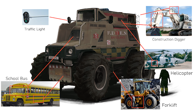
After much spending a good amount
of time adding, reworking and manipulating images together, I got the front and
back view of my vehicle completed.
I added a person alongside to give
a visual representation of the size I imagine the vehicle to be plus a shadow underneath
to give some more 3D depth.
During the process of
photobashing, I tried to keep a good balance between my primary big shapes,
secondary shapes and tertiary details- it was very tempting to go overboard on
the small parts because I had so many images at my disposal that I wanted to
use parts of everything. But to keep the vehicle looking realistic and believable
I had to have areas of rest alongside more cluttered spaces. This involved erasing
and lowering the opacity a lot on things like rust and tears to keep them
subtle and not detract from the vehicle as a whole.
Also, despite having many images
to choose from, I had to think outside the box to find sections of photographs
that would work well for my vehicle. My normal instincts tell me that if I want
a window then I should search for a window to use as a window however for some
sections I had to do some unconventional thinking to find a base for what I
needed. For example I wanted a mirror for the vehicle but all the images I
found had cars with mirrors of the wrong shape, wrong perspective, etc. I
changed my approach for this and began looking for something with the shape I
wanted rather than the actual object I wanted. This ended with me using a
traffic light as a mirror, drawing over it to get the details I wanted.

This was a bit of a challenging
final step since there was a lot I had to consider in regards to perspective,
proportions, whether things worked or not according to my final sketch but
overall I like the outcome of my vehicle. I think it suits the circumstances I’d
imagined for it (a bug apocalypse) well whilst also being fairly unique in
terms of design. It reads as an ambulance which was what I wanted but is also
semi exaggerated what with the huge wheels and extruding additions on the
panels. I’ve learnt some techniques that I can see myself bringing forward into
future projects, like blocking shapes out in 3D as a starting point, and am more confident in my approach to photobashing.


No comments:
Post a Comment